Design Specifications
Grid & Media Queries
The CLF design is based on a 12-column fluid grid system. This grid uses percentages instead of pixels for column widths. The UBC brand identity elements (logo, a place of mind tagline and wordmark) are integrated in this grid system and its importance lies in ensuring layout consistency on websites that are using the CLF.
The grid system is combined with CSS3 media queries, to create several break points in the layout on various displays. Breakpoints are used for ensuring the layout looks good and functions well on the viewport in question and that all the content is visible, readable and easily accessible. These break points determine the screen resolution when elements on the page can:
- shift position (e.g. stack vertically instead of being displayed horizontally side by side)
- shrink or expand
- become visible (even though they are not displayed on other screen sizes)
- become hidden (even though they are displayed on other screen sizes)
The fluid grid has a set of breakpoints where the width of the container, column and gutters changes:
| Label | Layout width | Column width | Gutter width |
|---|---|---|---|
| Large display (large desktop, TV) |
1200px and up | 70px | 30px |
| Default (tablet landscape, up to desktop) |
980px and up | 60px | 20px |
| Portrait tablets | 768px and up | 42px | 20px |
| Phones | 320px to 767px | Fluid columns, no fixed widths | |
| Feature phones | 319px and below | Fluid columns, no fixed widths | |
Below are the media queries used:
/* Large desktop */
@media (min-width: 1200px) { ... }

/* Portrait tablet to landscape and desktop */
@media (min-width: 768px) and (max-width: 979px) { ... }

/* Smartphone to portrait tablet */
@media (max-width: 767px) { ... }

/* smartphones to smaller feature phones */
@media screen (max-width: 319px)
Responsive Classes
For faster mobile-friendly development, use these utility classes for showing and hiding content by device. Below is a table of the available classes and their effect on a given media query layout (labeled by device).
Note: These classes should be used on a limited basis to avoid creating entirely different versions of the same site. Their usage is intended to complement each device's presentation. Responsive utilities should not be used with tables, and as such are not supported.
| Class | 767px and below | 979px to 768px | Desktops |
|---|---|---|---|
| .visible-phone | Visible | Hidden | Hidden |
| .visible-tablet | Hidden | Visible | Hidden |
| .visible-desktop | Hidden | Hidden | Visible |
| .hidden-phone | Hidden | Visible | Visible |
| .hidden-tablet | Visible | Hidden | Visible |
| .hidden-desktop | Visible | Visible | Hidden |
Dimensions
The CLF is built on a flexible 12-colum grid, and the grid column and gutter sizes change size at different viewport sizes. Please consult the table below to view pixel dimensions for the header and the grid at various sizes.
| # | Viewport size |
|---|---|
| 1 | 1200px and above (pdf) |
| 2 | 980px (pdf) |
| 3 | 768px (pdf) |
| 4 | 320px (pdf) |
Theme Options
The UBC CLF offers 4 colour theme options for the Brand Identity Header.
Option 1: White on Blue
Generally used for executive units and UBC's top-level sites, the White on Blue is a good option for units that need a strong university brand presence. For the Unit Name background color, units can use the UBC grey or their own unit color if they have chosen one (see specifications).

Option 1: White on Blue with UBC grey, large and small screens. View working template

Option 1: White on Blue with unit color, large and small screens
Option 2: White on Grey
White on Grey offers a more neutral tone and is recommended for UBC's administrative units. For the Unit Name background color, units can use the UBC blue or their own unit color if they have chosen one (see specifications)..

Option 2: White on Grey with UBC blue, large and small screens. View working template

Option 2: White on Grey with unit color, large and small screens
Option 3: Grey on White
Grey on White is the most neutral theme and works well for units with a strong sub-identity. The soft colours shift the focus to the content rather than the Brand Identity elements. For the Unit Name background color, units can use their the UBC grey or their own unit color if they have chosen one (see specifications).

Option 3: Grey on White with UBC grey, large and small screens. View working template

Option 3: Grey on White with unit color, large and small screens
Option 4: Blue on White
Blue on White offers the same advantages as Option 3 and works well for units with a strong sub-identity. For the Unit Name background color, units can use the UBC blue or their own unit color if they have chosen one (see specifications).

Option 4: Blue on White with UBC blue, large and small screens. View working template

Option 4: Blue on White with unit color, large and small screens
Layout Options
Option 1: Default - center aligned container, with a maximum width of 1200px
This default layout is available in all the colour themes listed above: White on Blue, Blue on White, White on Grey and Grey on White. For this layout, the CLF footer spans 100% of the viewport width, while using the Bootstrap fluid grid system.
If you are using background colours or graphics, you might want to remove the left and right padding on the main container.
Please note the set of guidelines that apply to the default layout CLF.
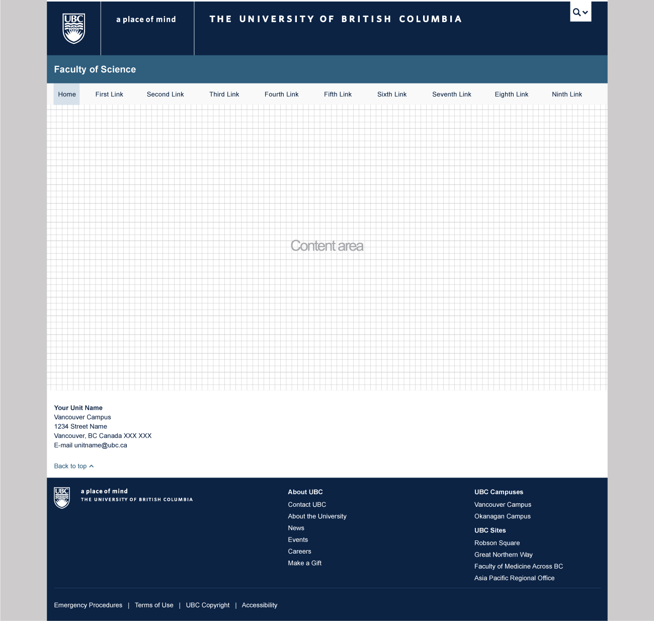
Option 1: Default CLF, white on blue.
Option 2: Full width, center aligned
This layout is available in all the colour themes listed above: White on Blue, Blue on White, White on Grey and Grey on White. The full width layout makes use of the entire background area and should be used with wide, high quality graphics or for types of content that require a large area (e.g. large data tables). For this layout, the CLF footer has a fixed width, while using the Bootstrap grid.
With this layout, you can either make use of the entire width of the content area: view working template.
Or you could use a fixed width for the content area and center it: view working template.
If you are using background colours or graphics, you might want to remove the left and right padding on the main container.
Please note the set of guidelines that apply to the full-width CLF.
Keep in mind the site's performance if using large images.
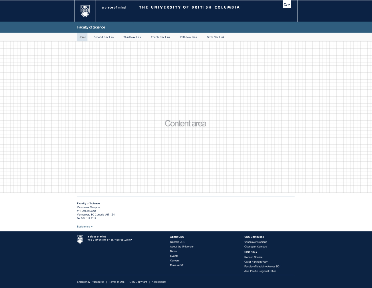
Option 2: Full width, center aligned CLF, white on blue.
Option 3: Full width, left aligned
This layout is available in all the colour themes listed above: White on Blue, Blue on White, White on Grey and Grey on White. The full width layout makes use of the entire background area and should be used with wide, high quality graphics or for types of content that require a large area (e.g. large data tables). View working template.
Please note the set of guidelines that apply to the full-width CLF.
Keep in mind the site's performance if using large images.
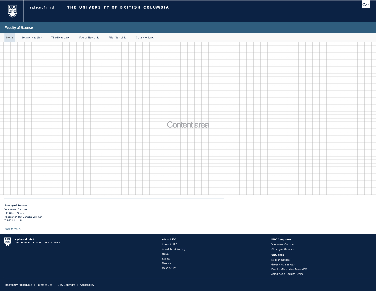
Option 3: Full width, left-aligned CLF, white on blue.
Back to topColours
UBC Colours
Colour is an emotional expression of identity and the primary colour, UBC Blue, combined with a crisp, bright UBC White creates a powerful ambassador of the UBC Brand. The secondary colour UBC Grey is available in a range that allows for sheer and transparent looks.
Primary Colour UBC Blue

- PMS: 282
- CMYK: C100 M90 Y13 K68
- RGB: R12 G35 B68
- HEX: #002145
Primary Colour White
White provides the clean, crisp white space translation of an “open” look and feel.

- HEX: #FFFFFF
Secondary Colour UBC Grey (for web use)

- PMS: 5405
- CMYK: C68 M35 Y17 K40
- RGB: R47 G93 B124
- HEX: #2F5D7C
UBC Grey Series
A specified Pantone® Matching System (PMS) 5400 range of related Greys or equivalent screen tints.

- PMS: 5415
- CMYK: C42 M8 Y0 K40
- RGB: R94 G134 B159
- HEX: #5E869F

- PMS: 5425
- CMYK: C45 M19 Y9 K24
- RGB: R152 G178 B195
- HEX: #98B2C3

- PMS: 5435
- CMYK: C31 M8 Y6 K11
- RGB: R195 G208 B219
- HEX: #C3D0DB
Unit Colours
Choosing a Theme Colour Option
If your unit doesn't have a specific colour, use a theme option combination of the UBC Blue or the UBC Grey.
Using a Specific Unit Colour
Unit colours may be used as backgrounds for the Unit Name and also in the content areas. There are certain requirements for unit colours used in conjunction with type, and they are meant to ensure strong contrast, legibility and compliance with web accessibility standards:
- Use only solid colours (do not use gradients) for the Unit Name background
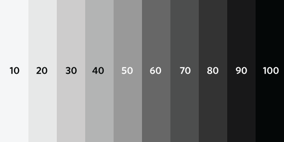
- Use solid background colours at an equivalent of 50% grayscale or above (illustrated below)
- Use only reverse type (white) for the Unit Name (Note: Arial is the only typeface that can be used for the Unit Name)
Note: If you are unsure of your choice, you can run a colour accessibility check to make sure the contrast ratio is at least AA compliant.
Selecting a Colour Translation Across Media
Some units have chosen a specific sub-identity colour that they use consistently throughout communication materials, including print and digital applications, and the web. Finding an accurate colour match across media can require special attention to ensure colour integrity. In cases when the automated translation (i.e. CMYK to RGB) fails to capture the colour intention, it may be necessary to visually adjust channels in order to find a stronger custom match. Respect the hue and adjust the chroma to suit the media.
Back to topTypography
The default font used on the CLF is Arial (Regular and Bold).
The Hoeffler & Frère-Jones font Whitney is UBC’s institutional typeface. The Whitney web font is available at no cost to all UBC websites with the CLF (Common Look & Feel) Templates. The web font is only available to UBC departments whose websites:
- use a *.ubc.ca subdomain (e.g. hr.ubc.ca or science.ubc.ca), and
- employ the UBC CLF (Common Look and Feel) Templates.
Submit a request for the web font
Typography Specifications
The default body text size is 14px with a line-height of 20px. The default type sizes, spacing and alignment have been carefully selected to ensure strong contrast and legibility on various screen sizes.
h1. Heading 1
h2. Heading 2
h3. Heading 3
h4. Heading 4
h5. Heading 5
h6. Heading 6
Units can make changes to type and heading sizes, but need to keep in mind readability, color contrast and alignment on various screen sizes. Please test a text sample on small, medium and large screen sizes before deciding on type size.
In addition to typography, the CLF also includes a comprehensive set of icons .
Styles & Scripts
Bootstrap, the underlying design framework for the UBC CLF, comes with a wealth of built-in CSS styles and UI (user interface) components that have been tested and proven compatible with Responsive Web Design techniques, touch screen devices, and popular browsers. We've taken advantage of this by integrating these features with the default CLF package (Why reinvent the wheel, right?). But we've taken extra steps to ensure that they align with UBC's brand colours and that they meet web accessibility standards.
Note: While these colors are recommended, units are free to customize the look and feel of all UI elements.
Base CSS
Includes styles for: typography, code, tables, forms, buttons, images, icons.
Components
Includes UI components for: dropdowns, button groups, button dropdowns, navs, navbar, breadcrumbs, pagination, labels and badges, typography, thumbnails, alerts, progress bars and more.
Javascript
Includes scripts for carousels, collapsible elements, tabs and dropdowns.
Back to topGuidelines
Guidelines for the UBC CLF are defined in three categories:
- Minimum Requirements;
- Highly Recommended; and
- Optional
Minimum Requirements
There are parts of the CLF that are mandatory or required for all UBC websites. This ensures that UBC websites have a minimum level of uniformity in visual presentation and functionality, hence the term "common look and feel". The parts defined as minimum requirements are marked in red.
Highly Recommended
These parts of the CLF, while optional, are critical elements we highly recommend that you keep intact and incorporate into your site.
The CLF Templates have been designed following best practices in usability and have been rigourously tested for compatibility across multiple browsers, operating systems, devices, and screen resolutions. Furthermore, the design and code meets web accessibility standards. Any modifcations to the highly recommended parts may result in undesirable effects and compatibility issues. The parts defined as highly recommended are marked in yellow.
Optional
Finally, the optional part of the CLF is the area where units have the freedom to create and incorporate custom design styles. The part defined as optional is marked in green.
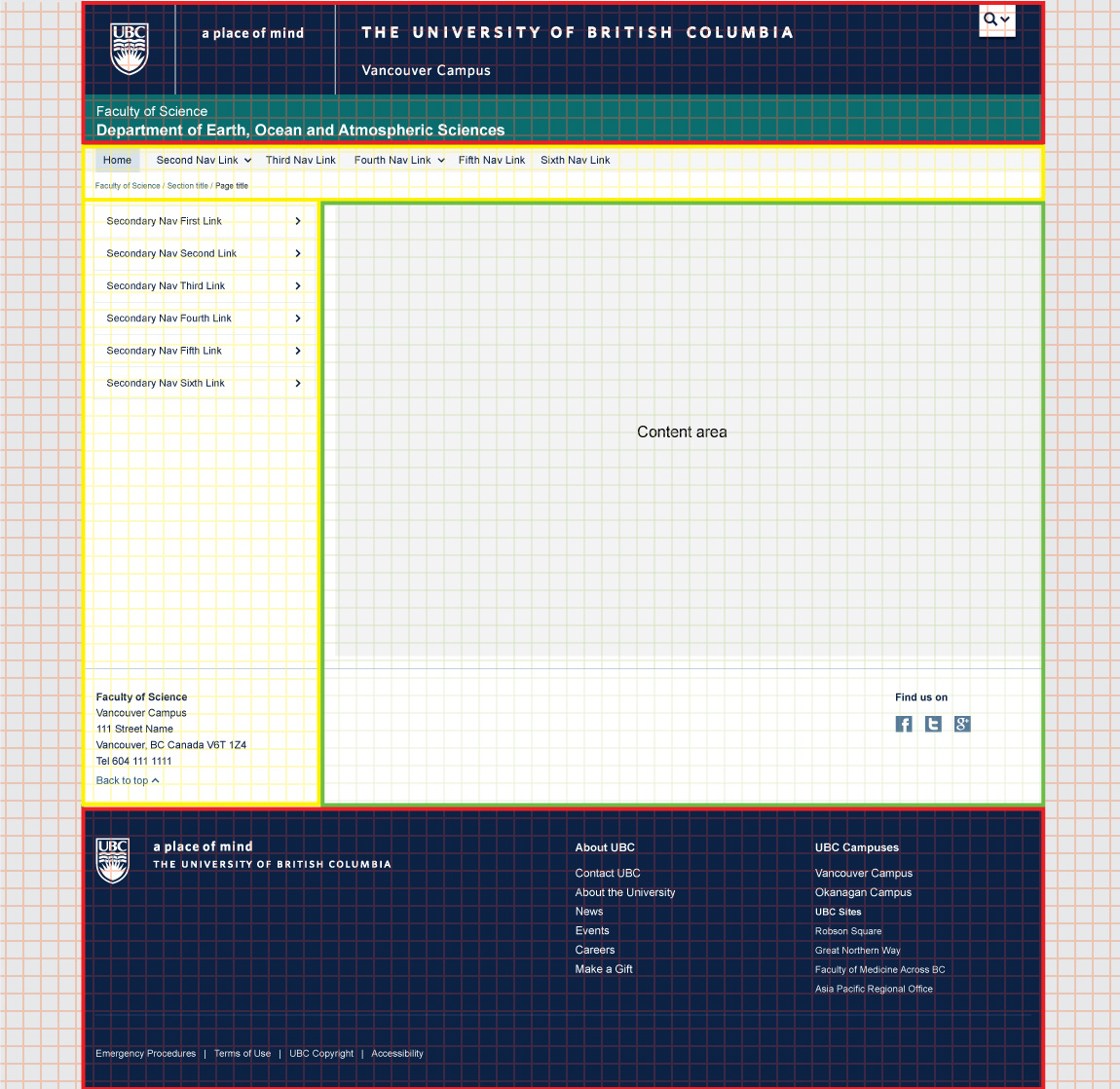
Sections of the CLF - Mandatory, highly recommended and optional
- 1 Global Utility Button
- 2 Brand Identity Header
- 3 Campus Identification (if applicable)
- 4 Faculty Name (if applicable)
- 5 Unit Name
- 6 Brand Identity Footer
- 7 Global Utility Footer
- 8 Background*
- *Except for the full-width CLF theme which makes use of the entire background area
- 1 Unit Primary Navigation
- 2 Breadcrumbs
- 3 Unit Secondary Navigation (if applicable)
- 4 Unit Sub Footer**
- **Only the contact details formatting is highly recommended.
- 1 Unit Content Area
- 6 Unit Sub Footer
Do's and Don'ts
While the CLF is highly flexible and customizable, there are a few areas and items that should not be altered in any way, to ensure a consistent and predictable experience across all UBC websites.
Please note that all the UBC brand assets (logo, tagline, signature) contained in the CLF templates and on this guidelines website are intended for web use only. If you require assets for other purposes such as print media, please consult the UBC Brand website.
Do add your full Unit Name, vertically centered on the unit name bar

Do add your Faculty Name (smaller type size) right above the Unit Name (larger type size)

Do add your administrative Unit Name, vertically centered on the unit name bar

Do not change the Unit Name type color, you must always use reverse type (white)

Do not change the Unit Name and Faculty Name (if applicable) typeface, you must always use Arial

Do not include any logos or graphics in place of / near the Unit Name
Do not modify the Brand Identity Header and its content in any way

Do not modify the Brand Identity Footer or the Global Utility Footer and their content in any way
You should also consider the following design guidelines:
- If your unit identity includes the UBC Logo, avoid stacking it with the UBC Logo in the Brand Identity Header.
- In general, avoid UBC Logo versions in close proximity.
- The dimensions of the UBC Logo have been kept intentionally minimal in the Brand Identity Header. Units repeating the UBC Logo (crest) should alter the scale of their own logo so that the size is substantially different from the one in the Visual Identity Header in order to provide visual clarity and to add interest to the page.