Improved Design
Why have we made these changes?
Our goal was to simplify the design to accommodate cleaner content and simpler navigation schemes, which are in line with responsive web design techniques, the mobile first approach and that will lead to a more pleasant user experience.
Old vs. New
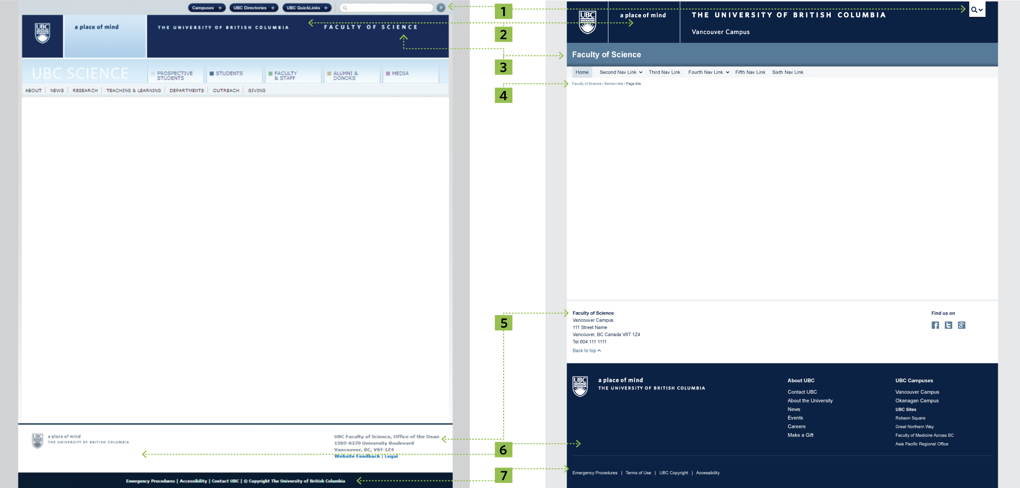
Here is a comparison of the previous CLF with the new and improved CLF 7.0 on a Faculty of Science example.
Some of the improvements we've made
1 Global Utility Button
The Global Utility Header on the previous CLF comprised of the global search bar and three buttons which activated a collapse menu - a Campuses button, a UBC Directories button and a UBC Quicklinks button. The content in this collapsible area was separated into two categories - Vancouver campus and Okanagan campus.
In the new CLF, we have simplified the global resources area considerably, and replaced it with one single button - the Global Utility Button. This button provides quick and easy access to UBC's Google Search Engine and UBC's most visited resources for both campuses. It is designed to be minimal and unobtrusive, taking advantage of a dynamic collapse menu system to keep content hidden until activated by the user.
The 'a place of mind' tagline background is no longer customizable and it only uses UBC colors, UBC blue, gray or white, depending on the CLF theme chosen. This will ensure an increased consistency among UBC websites using the new templates.
2 Brand Identity Header
On both versions of the CLF we have the Brand Identity Header which consists of the UBC Logo, tagline (a place of mind), wordmark. On the new CLF, we have simplified the header by removing the collapse megamenu that was triggered by clicking the 'a place of mind' tagline. Its size also responds to different screen resolutions. On smaller screens (e.g. tablet and smartphone), the three blocks collapse into the UBC full signature and the campus identity, which has been added to bring more awareness to the fact that UBC is a two-campus university.
3 Unit Name
The Unit Name is the label identification of a website. In the new CLF, the Unit Name has been removed from the Brand Identity Header and awarded its own space, right under it. This will help bring more focus to the Unit Name, as people scan the page in an 'F' pattern and it also allows units to colorize the background in their own unit color or in UBC colors, depending on the CLF theme chosen.
4 Breadcrumbs
A consistent design for breadcrumbs has been added to the new CLF to help users quickly navigate to a parent section of a website.
5 Unit Sub Footer
On the new CLF, the unit contact information has been moved out of the Brand Identity Footer area and has been awarded its own space and consistent formatting in the Unit Sub Footer.
6 Brand Identity Footer
This area has been improved by adding two content sections, 'About UBC' and 'UBC Campuses and Sites'. This information was behind a click on the previous CLF and is now easily visible without any user interaction.
7 Global Utility Footer
We have simplified this area and included just four links, Emergency Procedures, Terms of Use, UBC Copyright and Accessibility.
* Improved UI elements
All UI elements for the content areas have been redesigned to match the rectiliniar style of the Brand Identity Header. The size of UI elements (e.g. carousel controls, buttons) was carefully selected to be in line with human interface standards, so that they are easily accessible and clickable / tappable on all screen resolutions.